CLIENT WORK / TINY RIDERS
Tiny Riders.
A local service, online.
Website design & development · Austin area
Tiny Riders brings car-seat guidance to families at home. We built its public website around the questions a parent needs answered first: what help is available, where it is offered and how to arrange a visit.
A calm visual identity, distinct service pages and a straightforward inquiry path connect those decisions.
Visit the live Tiny Riders website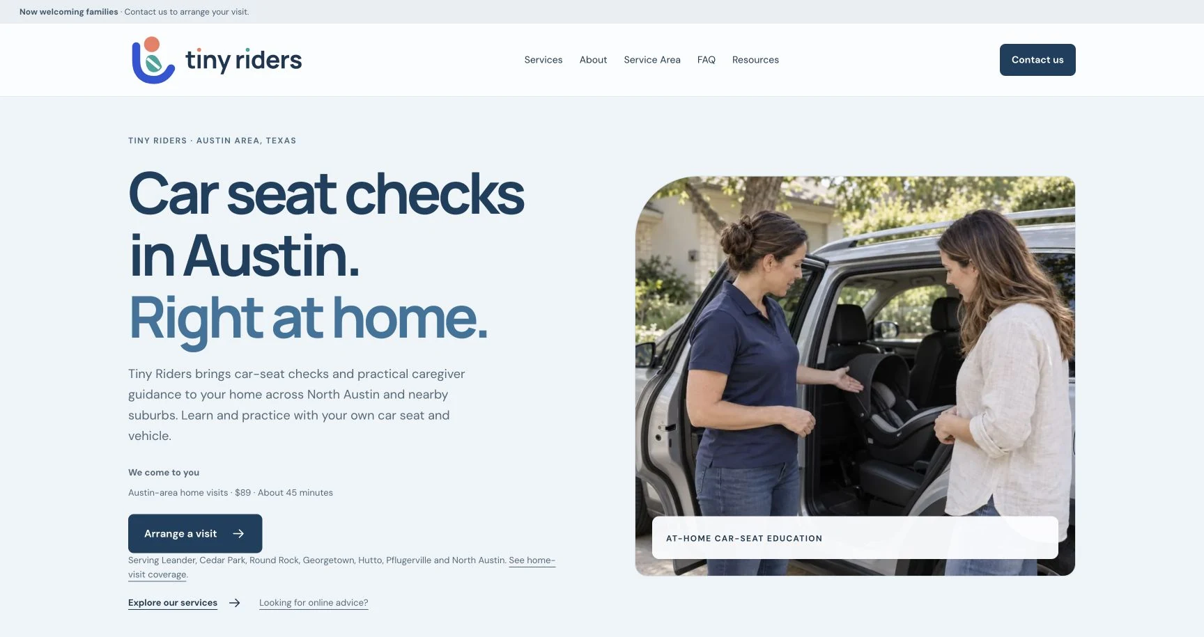
- THE BUSINESS
- At-home and online car-seat guidance.
- OUR WORK
- Website design, frontend build and search foundations.
- THE EXPERIENCE
- Service information → local coverage → email inquiry.
01 / MAKE THE SERVICE EASY TO UNDERSTAND
The right information.
Before the first email.
An at-home visit and an online advice session serve different needs. The website gives each its own page, with the service, price, duration and what to expect explained together.
The homepage introduces those choices without making a visitor read every detail at once. Service-area guidance, common questions and useful resources have their own places in the navigation.
On a phone, the content becomes a single readable column, with the service and next action kept together. The design uses generous spacing, a restrained blue palette and clear type throughout.
Explore the service pages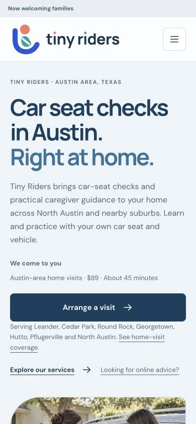
02 / DESIGN THE NEXT STEP
Start a conversation.
Set clear expectations.
The public site uses a prepared email draft rather than an online checkout. It asks for the details needed to begin the conversation, and explains that Tiny Riders confirms the appointment directly.
- 01
Choose the help
Compare an at-home visit with online advice. Check whether the home-visit area fits.
- 02
Send an inquiry
Open an editable email draft with prompts for the service, city or ZIP code, and number of seats and vehicles.
- 03
Confirm together
Tiny Riders replies to agree the details. The page makes clear that an inquiry is not a reserved appointment.
The draft opens in the visitor’s email app and is sent only when they choose. The public website does not take online bookings or payments.
See the actual inquiry page03 / BUILD THE DETAILS THAT SUPPORT IT
Thoughtful on the surface.
Considered underneath.
The public experience is supported by a lightweight static build, responsive imagery and a clear page structure. Each choice serves a practical purpose.
A focused public build
The public pages are published as a static website, separately from private operational software. Visitors can read the service information without signing in or relying on a booking application.
Images sized for the screen
Responsive image versions let the browser choose a suitable size. Reserved image dimensions keep room in the layout, while the opening image receives loading priority.
Useful, discoverable pages
Services, coverage, questions and resources have their own URLs. Page titles, descriptions, canonical addresses, structured data and a sitemap provide the search foundations.
THE FINISHED SCOPE
More than a homepage.
The delivered public website includes service pages, an Austin-area coverage page, frequently asked questions, resources, contact information and policies. A local car-seat check guide helps visitors compare the available types of help.
This is a multi-page project. It illustrates how we organize a service business’s information and inquiry journey; it is not an example of everything included in a $495 one-page package.
For your site, we agree the pages, editing needs, inquiry method and any connected tools before confirming the scope and price. Compare one-page, multi-page and platform-specific scopes.
Case study by Simplify Labs · Published October 25, 2026. Screenshots show the public website on that date.
LET’S MAKE YOUR SERVICE CLEAR
What should customers
understand first?
Share your website and what you want to improve. Start with a small free design concept, then review it by email, phone or an optional Google Meet. No obligation to continue.